

![]() American Airlines has been using the same logo and aircraft livery for more than 40 years. The AA symbol, for example, complete with eagle,was created by Massimo Vignelli in 1967. Last week they announced a complete revamp. The new image was created by FutureBrand with input from AA customers and employees.
American Airlines has been using the same logo and aircraft livery for more than 40 years. The AA symbol, for example, complete with eagle,was created by Massimo Vignelli in 1967. Last week they announced a complete revamp. The new image was created by FutureBrand with input from AA customers and employees.
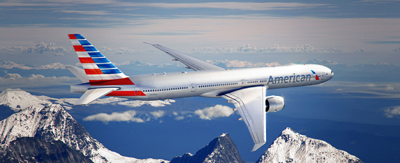
- The AA Logo on the tail is gone
- There is a new stylised red and blue tail which American’s Chief Commercial Officer describes: “Our core colors — red, white and blue – have been updated to reflect a more vibrant and welcoming spirit. The new tail, with stripes flying proudly, is a bold reflection of American’s origin and name”
- The Eagle has moved to the front of the plane and is more subtle
- The American name is larger and appears in grey
![]()
So what do you think of the new AA livery? Enough people hate it to have started a petition against it!


[…] American Airlines New Livery […]