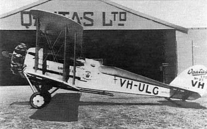
Qantas first formed on the 15th of November, 1920, 96 years ago this month. For its first 24 years, it carried only its name on the tail of its aircraft: Qantas, short for Queensland And Northern Territory Aerial Services.
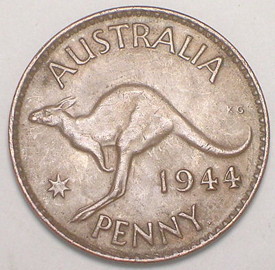 The Australian carrier adopted the flying kangaroo in 1944. The symbol was itself adapted from the Australian one penny coin.
The airline has changed its symbol four times since.
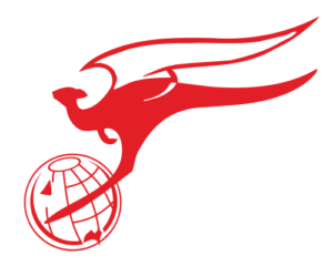 In 1947, with the arrival of Lockheed L749 Constellations on the Sydney to London route, a 63 hour multi-stop service known as “The Kangaroo route”. To celebrate the service, the winged kangaroo symbol appeared on Qantas aeroplane tails. It was carrying the globe with its feet.
1968 was the next change. The globe was removed. This was the logo that appeared on Qantas 747 fleet from 1971.
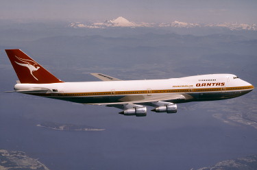
In 1984, a further change as the Kangaroo lost its wings in a slimming makeover, as depicted in the tail third from the front. I was a little sad about the loss of the wings! I started flying Qantas in 1997 so this was the tail that I saw for the next decade. Planes also carried the slogan “The Spirit of Australia“.
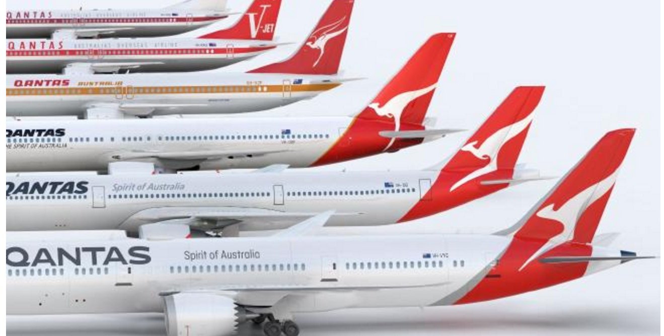
The second tail from the front shows the 2007 change. In this one, the Roo’s feet no longer touched the ground. The tail pointed more upwards than in prior iterations. The Qantas name became italicised and the slogan was shortened to “Spirit of Australia”
The latest change was this week. The announcement of the arrival of the Qantas 787 (which I will write about tomorrow) has been accompanied by a new look. The kangaroos seems to have lots its paws and become more flowing. There is shading on the rear of the kangaroo’s body and tail.
 The font on the side has also changed. I am less a fan of that!
This video explains the philosophy and changes.
What do you think of the brand “refresh”?
Related Posts
- 21 times around the earth with Qantas -my 350th #QF Flight
- Qantas goes outdoors with its iconic safety video
- Qantas Barbie travels world celebrating 95th Birthday


Leave a Reply