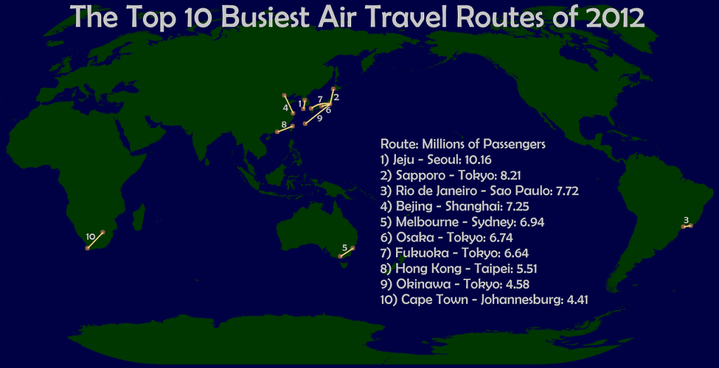
Was fascinated by this mapping of the Top Ten busiest air routes by Visual Statistix. The article is from Amadeus which noted that 300 of the world’s routes carry 20pc of the world’s passengers. They also state that each of these 300 “super routes” has one million plus passengers per year.
It seems seven of the top ten routes are in Asia, one in Australia, one in Africa and one in the Americas. Considering 60 per cent of the world’s population live in Asia, this makes sense.
The high use of trains in Europe probably explains why there are no routes in the top ten in that part of the world. For example, The Paris CDG -London Heathrow air passenger numbers probably only number three million whereas Eurostar carried 9.9million people last year. I am also interested in the impact of the Beijing to Shanghai high speed rail which is two years old. In the first year the High Speed line carried a staggering 52.6million people.
I thought traffic between London Heathrow and New York JFK but it only sits at 2.5million with a further million traveling between LHR and Newark. I also am puzzled as to why LAX to San Francisco is not in the top ten.
I have flown exactly 500 routes but only one of them (Sydney to Melbourne) is in the top ten. Anyone flown most or all of the top ten routes?


You might need to make a correction. Eight routes in Asia, One in Africa, and One in South America. There are no routes in the top 10 in the USA.
Hey, I do not see any top ten route in the USA. Very interesting piece of information, anyway, and yes, it is surprising that all of the busiest routes are in Asia, or emerging countries like Brazil or south Africa. Rgds!
I didn’t read the background, but do they count all multi/co terminals? In for instance NYC-London, where NY is served by 3 airports and London by 2. Paris has both CDG and ORY etc.
Exactly, Brazil, in south America.
I see that there are 22 flights next Tuesday between JNB and CPT (one of the city pairs in the top ten), of which 19 are on narrowbodies (variants of the 737 and 320 families), two on 340 family aircraft and one on 777 (according to Flightstats and excluding codeshares).
Looking at LHR and JFK on Tuesday, there are 19 flights, all on widebodies (6 x 747, 7 x 777, 3 x 767 and 3 x 330/340). This is substantially more capacity and therefore either the article is plain wrong, or airlines choose to run empty planes between LHR and JFK, or SA airlines have removed all their seats and it’s standing room only.
I conclude that the article is plain wrong. And it ignores LCY, LGW and EWR pairings, which are essentially the same origin and destination.
One possible explanation is that the amadeus report talks about people purchasing tickets on routes, so a BA passenger buying a ticket from, for example, NCE to JFK via LHR would be excluded – but then so would a SAA passenger buying at ticket from, say, CDG to CPT via JNB. And LHR/JFK is renowned as being a very heavy O&D market.
In short, with statistics, if it smells fishy, it probably is.
@NB This is only O&D traffic. Like you said, a passenger is only counted in this if they bought a stright one segment flight. It is reasonable that there’s a lot more one segment purchases involving JNB-CPT than LHR-JFK.
Just to correct, route 3 is in Brazil, South America, not Asia. 🙂
@Bo. There may well be a higher %age of O&D traffic between JNB and CPT than LHR and JFK but I question whether it’s so massively more. Remember that SAA brings almost all of its longhaul CPT traffic through JNB.