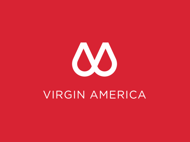
Virgin America revealed their new logo today. Yes it does look like what you think it looks like…
Interestingly it bear’s some resemblance to Aibnb’s logo which caused a stir when it was launched:
 It is an April 1st Prank but many people thought it was serious.Virgin have described this new logo as “A labor of love” and say “Fundamentally, this is a human-centered brand – one that hits you where it hurts.” They further say: ”
They further say: “The combination of sharp angles and sleek, sexy, supple curves are meant to surprise and delight upon repeat views” MMMMM.. yes…maybe.
If you are not convinced it is a joke, check out the accompanying video:
I wonder if the new logo is in preparation for its future takeover by either Alaska or Jetblue. Virgin America continue to be my favourite airline, followed by Jet Blue and then Alaska. I will miss them deeply if they go.


Leave a Reply